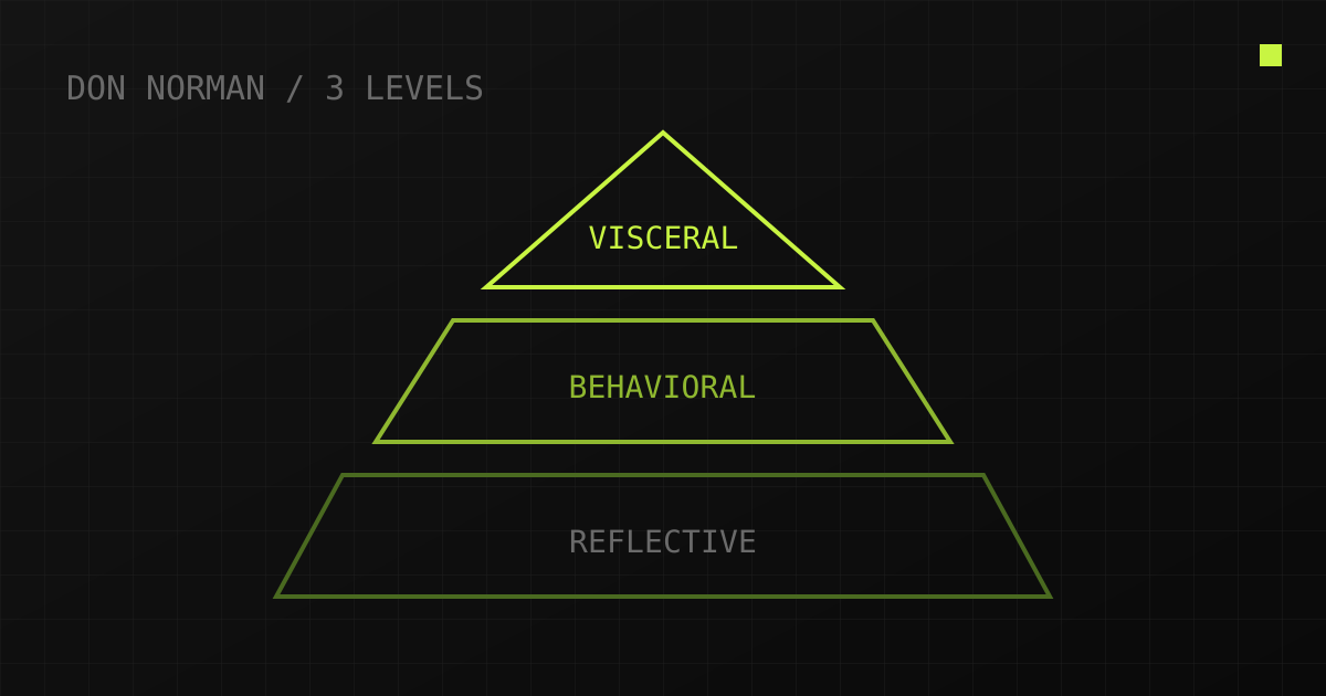
1. Visceral: the first impression in 50 milliseconds
The visceral level is pure aesthetics: form, proportions, materials, surface quality. The brain judges an object before we have even read the nameplate — within tens of milliseconds. In industrial settings this level is traditionally considered optional: "a machine tool should work, not look pretty". The market keeps proving otherwise.
A case in point — the SXS512 cylindrical grinding machine enclosure. The original housing was an honest "sheet-metal box": square corners, bare weld seams, catalogue pull handles. Technically flawless, visually anonymous. In the redesign we touched neither the bed nor the assemblies — only the outer shell. Sloped planes created a directional silhouette, perforation on the doors became both ventilation and a signature rhythm, and the door handle turned into a solid, pleasant-to-grip element.
The visceral-level result is measurable: at the exhibition, visitors approached the booth with the updated enclosure on their own — "what series is this?". Functionally it was the same machine. The first impression changed, and it converted into leads.
2. Behavioral: where ergonomics becomes the interface
The behavioral level is use: is it convenient, is it understandable, will I make a mistake? This includes workplace ergonomics, control logic and feedback. If visceral decides whether a person walks up to the equipment, behavioral decides whether they will work on it for years.
The IEK ARMAT air circuit breaker front panel redesign is telling. The original panel is classic electrical engineering: a lever, a status window, a test button — all on one plane, all small. The behavioral-level problem: the zone containing the hazardous element (a lever under load) is not visually separated from the information zone. A user in gloves, in the dim light of a switchboard, has to "re-read" the panel every time.
The solution is risk-based zoning: functional blocks are separated by relief and scale, the racking handle received pronounced finger grooves and a polished edge — you find it by touch, without looking. The display, NFC tag and QR code are grouped into a calm central block. The panel became readable in a second — that is behavioral design: the form itself suggests the usage scenario.
Good behavioral design is invisible: people simply use the equipment without thinking. Bad behavioral design is instantly recognizable — by the duct-tape notes saying "DO NOT PRESS" on industrial consoles.
3. Reflective: what the product says about the brand
The reflective level is meaning and identity: what I feel owning this product, and what it communicates about the company. In B2B this level works through trust: equipment is the most massive and longest-lived brand carrier — it stands in the customer's shop for 15 years and "talks" about the manufacturer every day.
The STAN design language built into the same SXS512 is deliberate reflective-level work. Consistent radii, repeating perforation, a recognizable graphic rhythm across every machine in the line: you identify any of the brand's machines from afar — the way you recognize a Mercedes by its grille. For a customer this is a signal: "a manufacturer that controls design down to the millimetre controls its tolerances the same way". External neatness reads as internal manufacturing culture.
That is why in mature companies industrial design is not a "prettiness department" but part of brand strategy: the catalogue, the website, the showroom and the equipment itself speak one visual language. The ValiandTech branding project followed the same principle: the logo, identity and 2026 catalogue were designed as a continuation of the products' own design language — the same rhythm, the same radii, the same grid discipline. A client leafing through the catalogue after visiting the shop floor should feel no "gap" between the promise and the hardware.
4. The Aesthetic-Usability Effect: why beautiful feels easier
A measurable psychological effect amplifies all three levels: the aesthetic-usability effect. Users perceive attractive products as easier to use — and, more importantly, they tolerate minor flaws more patiently. Classic ATM experiments (Kurosu & Kashimura, 1995) showed that interfaces identical in logic were rated "more usable" when neatly rendered.
For industrial equipment this works twice over:
- operators treat a "beautiful" machine more carefully — less careless wear, gentler handling of controls;
- minor usability flaws (a shallow menu, a less-than-ideal nameplate) are perceived more leniently if the product as a whole feels well thought out.
The reverse side matters too: aesthetics masks but does not replace. If the behavioral level fails, a pretty enclosure buys you only a couple of months of loyalty — after that operators vote with duct tape and homemade covers.
5. All three levels in one product: a study example
Let us see how the model works simultaneously on a simple product — a faucet concept designed for serial production:
- Visceral: a sculptural silhouette and two finishes — matte black and gold. The product "photographs itself", which for sanitary ware means free features in design media.
- Behavioral: inside — a standard cartridge and standard fittings. Installation is no different from a mass-market model, the plumber gets no surprises, servicing uses off-the-shelf parts. Modern aesthetics punishes neither the installer nor the owner.
- Reflective: the product positions the brand as "accessible design" — not elitist exotica, but a deliberate alternative to faceless catalogue series.
The key takeaway: the levels do not compete for budget. The standard internals (behavioral) freed resources for form and finish (visceral), and together they created the positioning (reflective). Compromises begin only when one level is remembered at the expense of another.
Conclusion: applying the model in practice
Norman's model is a convenient audit checklist for any product:
- Visceral: what first impression does the product make in photos and in person? Would anyone photograph it next to competitors?
- Behavioral: can it be used without a manual and without mistakes — in gloves, in the dark, in a hurry? (Ergonomic assessment methods help here — see the RULA and REBA breakdown.)
- Reflective: is the product recognizable as "ours" without a logo? What does it say about the company?
It helps to run this audit in pairs: a technical specialist assesses the behavioral level, while a "fresh eye" covers visceral and reflective — your own product always seems more recognizable and more intuitive than it really is. Repeat the review against new competitors once a year: the bar for first impressions rises constantly.
Failure at any level drags the others down: a beautiful but inconvenient machine disappoints; a convenient but anonymous one loses the tender to the one that was remembered. Strong equipment design holds all three levels at once — and, as the cases in the portfolio show, it is a matter of method, not budget.
Want this kind of breakdown for your product?
I will run a three-level audit: visuals, usability, identity — with a concrete list of improvements and a cost estimate.
Discuss your task →